Components
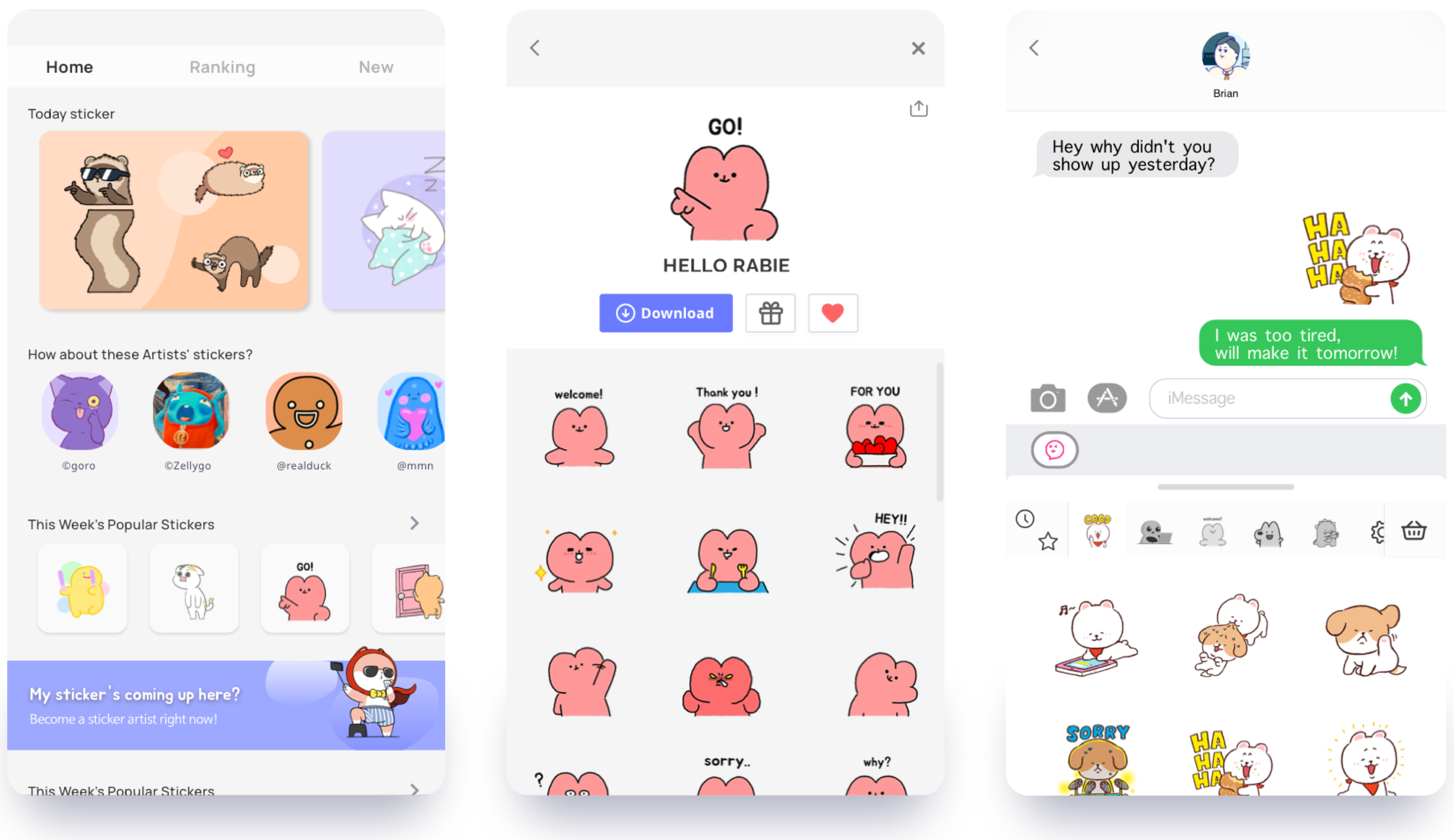
Here are some of the key components you can take into consideration when building your own UI for the sticker integration.
Unity
Make sure to have unity in buttons and phrases when designing. It helps the user to have better experience.

Balance
Having balance when choosing the colors is important.

Space
Remember that sticker should have enough space for it self to be shown to the users in the best form.

Hierarchy
Stickers do best when they stand out in the design, not the design it self standing out.

Was this page helpful?
We’re here to help. Contact us.
 Back
Back